HN Simulatornew | past | comments | lists | submit | fredley's commentslogin

With RAM prices what they are, I'm glad we've found a way to turn LLMs back into RAM.

The company that built your phone can disable it, making it physically useless. It is not hard to imagine the same tech shipping baked into GPUs.


> horse

I think you mean unicorn


What do you do when your rear tyre gets a flat?


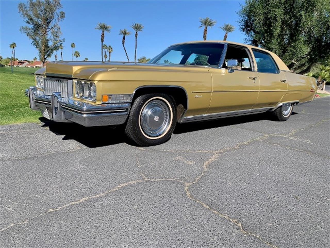
Same thing you did sixty years ago when your Cadillac got a flat: take the cover off the wheel well.

https://photos.classiccars.com/cc-temp/listing/165/1814/3484...


The panel over them called a fender skirt comes off usually, this is far from the first car with skirts or spats. They used to be quite popular.


Presumably the faring panel comes off, just like on an early-model Honda Insight


No different than the front tire, same thing as any modern car which does not carry a spare tire either.


Counterpoint: building integrations for SAP is not art.


For sure it wouldn't be a Sagrada Familia, but maybe in ballpark of a single stroke bathroom stall dick doodle.


Perhaps it's just bad art.


Not that anyone needs any validation of how dumb this all is/was, but high testosterone levels don't necessarily mean you're going to be a burly muscly macho man. https://youtu.be/1162ouPHH3Q?si=ZAy5vo3loo0EfYbu&t=84


Ctrl-F load-bearing. 1 hit.


> A versatile, modern, humanist sans-serif with a neutral aesthetic

Good God I am sick to the back teeth of the neutral aesthetic. If you're going to spend all that money, can we have some _opinionated_ typefaces please? Especially against the backdrop of AI making everything look and feel exactly the same everywhere, the last thing anybody needs is another neutral, characterless, soulless typeface.


There's something so ... bland about this typeface. I get no feeling from it whatsoever. It's like the textual embodiment of the AI conversational style.


Its very boring. This trend started with the Nazis taking away Fraktur. Bland typefaces=nazism (this is what Adorno would say probably).


I definitely agree with your sentiment in general. However, I'll note that I find this sans serif to have a nicer feel than many I see these days (even among humanist ones) and it's cool that they've managed to achieve that while being acceptably inoffensive for mainstream use


I thought the picture on your home page was very cool, and then I moused over it. Absolutely incredible.


The 3Blue1Brown video on holograms is fantastic: https://www.youtube.com/watch?v=EmKQsSDlaa4


Guidelines | FAQ | Lists | API | Security | DMCA | Apply to YC | Contact

Search: