DXOMARK sells test equipment and consulting services for (among others) camera tuning.
Naturally, they won't attack the image quality of a customer who purchased their test equipment and/or consulting service (usually not publicly known who did that), so they often tone down some of their statements when they review a device (and shift the attention to other areas).
Always interesting to check out the scores of DXOMARK competitors in parallel, e.g. VCX[0] which strives for an objective scoring scheme (but didn't test the device yet, indicating that they at least didn't have an early sample)
I don't know about smartphone sensors, but the DXOMARK sensor ratings for full-frame digital cameras largely mirror my own experience with them, so at least there they seem to be a fair judge.
I'm surprised that in no reviews of the iPhone 18 camera there is mention of the bad quality bokeh, it has heavy ring shapes that looks like what you'd get from a cheap catadioptric lens.
That is from the normal (24mm) camera slightly stopped down (f/1.8), judging by the EXIF.
Odd bokeh was one of the risks of adding a mechanical aperture, and bokeh is very often weirdest at the first or second down from open.
I would hope that the telephoto lens does not show this so severely (because it has a fixed round aperture) but all mobile phone lenses in my experience have had a tendency towards a sort of concentric-ringed, quasi-soap-bubble bokeh; it's a common part of the challenge of really tiny optics (that you either like or dislike). (The iPhone X was really distinctive in this regard). So it's not too surprising to see the aperture do this on top of that.
As a general rule you don't see it in average images, but I guess sensors are now high-enough resolution that it's becoming more obvious, and the blades of a mechanical aperture might make it quite noticeable in some situations.
> Polygonal aperture openings are not the cause of soap-bubble bokeh
Errr, quite obviously not, indeed. But then I didn't say they were?
I said all phone lenses tend to have soap bubble bokeh as a consequence of their optics. Almost all phone lenses don't have mechanical apertures; they have fixed ring apertures and also tiny aspheric lenses.
(In the industry it's seemingly called "onion ring bokeh" to distinguish from soap bubble, presumably because it has more than one ring.)
However! The first stop down of a mechanical iris has a tendency to have odd effects on the lens's bokeh.
You get an interference of the aperture blades and the wide-open bokeh. With a lens that is prone to ring bokeh, slightly stopping down will smear the edge of the bubble, but in this case it is also clearly boosting contrast as you expect (and an irregular shape at different angles)
Thanks for asking, NuclearPM. It was not actually a question. In informal English a question mark can follow a plain statement, where then it indicates a non-specific uncertainty. In the case above, the sentence could be interpreted generally as: “I didn’t say they were... and I'm not sure what gave impression I did" or "I didn't say they were... I think you misinterpreted."
I would argue against the siblings and say, yes, it's a question; it's a shortening and softening of the rhetorical "But then I didn't say they were, did I?"
It's not due to the aperture blades. It's due to the amount of spherical aberration in the lenses.
Professional camera lenses carefully control this. It's actually one of the only intentional "flaws" added to lens. Technically bokeh with a slight ring on it (on point lights) usually results in a tack sharp lens. You can see this in most macro lenses.
Portrait lenses are sort of the opposite - they want super smooth bokeh (point light sources in the blurred out of focus area will have a nice gradient that is soft and gradually drops off toward the edges). This results in a lens that has slightly less sharpness on the in focus portion. It's not that noticeable though on a great lens.
Most lenses are a balance. When shooting professional cinema many lenses are intentional chosen for their bokeh qualities. "Nervous" bokeh is more on the side of rings and is often found on older Russian and East German glass.
There are two lenses where the amount of spherical aberration is not baked into the lens. They were made by Nikon called "Defocus Control". The 105mm 2.0 DC and slightly older 135mm 2.0 DC both have a second ring that looks another aperture ring but allows adjustability of the spherical aberration from "nervous" to "smooth". They were marketed poorly and misunderstood but are some of the best glass you can get - they test insanely well and have huge flexibility.
> The 105mm 2.0 DC and slightly older 135mm 2.0 DC [...]
I almost never change the defocus control on the 135/2.0 from neutral, yet I believe the lens makes it almost impossible to take a bad portrait. The only reason to keep a DSLR around instead of a mirrorless is that this lens has an old-school camera driven auto-focus, which Nikon's F-to-Z adapters don't support. While manually focusing that lens can be done, the shallow depth of field makes it very challenging for moving subjects.
It's definitely worth messing with. The reason it has a F and R side (with aperture markings) is that a lens will be optimised to either provide ideal bokeh at close or long focus (long focus bokeh being things blurred in the foreground closer to the camera). Try setting it for example to F 2.8 real aperture and then I believe move the DC ring to R 2.8 or 4 and you should get a very pleasant creamy blur. Or for a slightly sharper portrait move to neutral or R 2.0
This is usually due to the blade shape and quantity I believe. The aperture is most likely to be less circular on the widest apertures after fully open unless you have quite a lot of aperture blades, as the curve to make a rounder aperture is usually applied more towards the tip of the blade, and you're only seeing the base of the blades at wider apertures. That varies a lot by aperture design, however - if you have the more banana-shaped blades where the retaining pin and pivot pin are at opposite ends (like in a Yashica TLR) then I believe they can maintain a more consistent curve along the length. Those also suck massively to reassemble, but that's a different story.
I haven't seen a diagram of how the aperture in this new iPhone is designed yet. There's a lot of different ways to do it, with lots of odd shape possibilities.
> This is usually due to the blade shape and quantity I believe.
Also because of things like angle of incidence?
The purely round lens will generally have nice round (or at least cats-eye) bokeh across the frame with an edge that degrades softly as a result of aberration, so beams of light from different angles tend to blur into each other.
As soon as you get aperture blades, you lose that soft edge, get contrast but also a lot of competing shape influences at different angles. They will tend towards more rounded shapes as you stop down more.
And that is putting aside that some aperture shapes are just really insane when they are nearly wide open, right? (Konica 40mm f/1.8 AR I am looking at you with your shuriken bokeh)
> I haven't seen a diagram of how the aperture in this new iPhone is designed yet. There's a lot of different ways to do it, with lots of odd shape possibilities.
Ooh yeah I love those weird shapes nearly wide open. I found a lens that had a torx bit shaped aperture the other day, I'll have to fish that out and see what it looks like in an image. Lots of compact cameras have a diamond/square-ish hole, notably the Minox 35 range from what I can recall.
Edit: just saw your update with the photos of the mechanism. Wow that's impressive miniaturisation. The hexagonal shape looks surprisingly good. I wonder what's causing the odd effects in the OP. I have noticed in the past that iPhone cameras produce square specular highlights through tree foliage, so I wonder if it's an extension of that oddity.
Yes that mechanism only has two blades! They are sort of sickle-shaped. (Presumably gave the Soviet cloners a chuckle)
I found myself looking at it when I was considering making a DIY aperture for my DIY lenses. (I've personally settled on swappable Waterhouse stops for now but I might fit an eBay microscope aperture, many of them have loads of blades).
Oh and now I'm going to end up looking on eBay for a Minox 35ML or 35GT again. Seriously, never do this while logged in; Minox 35 sellers may be among the most desperate I've ever seen in terms of sending you offers, it's relentless.
Haha there's certain camera models that are very prone to that. Some of the Pentacon M42 lenses are worth a look if you want an unholy amount of blades - I have a 135mm f/2.8 sat around that has like 15 blades or something daft.
Coincidentally I think I have a non-working 35GT in my market stall (https://camerasetc.wales), so if you want a project drop me an email as I'll send it to you for the cost of postage. I have too much in my repair backlog and those things are fiddly little bastards at the best of times :D
I too have too much clutter so I will have to turn down your kind offer but I will peruse your sites and I may ping you a note sometime about a particular lens I have been looking for — quite a random cheap old one I regret parting company with. (I'm in Kent but I have a friend in Cardiff and if my wallet does not protest I may pop in on your stall)
Ooh do drop me any odd things you're looking for - I never know what's going to turn up, and I do keep a lookout for anything people ask me about. I have debated trying some sort of online stock listing but I think that might just end in chaos due to the lack of space I have for organised storage and other people moving my stuff around.
That reminds me that I need to do a new update post, whoops. I've had an absolute buttload of Pentax K mount gear the past couple of months, which is quite annoying as I don't have that many customers that shoot it. I'll have to big up the Pentax cameras a bit more haha.
Do swing by if you're ever in town when the market's open! I've always got lots of fun cheap stuff kicking about, and a bin of broken shit if you need parts :D
> Minox 35 sellers may be among the most desperate I've ever seen in terms of sending you offers, it's relentless.
Because they are a nightmare to own. So lovely when they work but so frustrating because you keep readjusting the shutter mechanism with those tiny screws and you end up wasting so many rolls (and pictures) in the process.
I own a 35GT, barely use it but wouldn't sell it because I have too much empathy. It would feel like receiving money to spell a malediction on someone.
Soap bubble bokeh comes from overcorrected SA. Onion rings and related brightness anomalies/unevenness in bokeh are mostly the result of molded aspheric lenses. Stopping slightly down has not significantly impacted bokeh (apart from apodized lenses) since rounded aperture blades have been invented about fifty years ago.
The iPhone 18 aperture does not have rounded blades (except the tip). Six hooked blades, very truncated hexagon aperture (perhaps exactly a regular dodecagon, it’s a little difficult to tell from the promo images)
Following on for clarity, this is why the Duo lacks a dynamic aperture. Seems they must have been quite squeezed for space.l indeed.
Even on the 18 Pro Max the 8x zoom of the telephoto lens is just the 4x using the same 12 MP crop of the 48 MP sensor to "double" the 4x optical zoom as the last generation. I hope we can get some level of optical zoom on a future Duo.
> I'm surprised that in no reviews of the iPhone 18 camera there is mention of the bad quality bokeh
PetaPixel reviewed the bokeh, and called it "meh" and "not very nice". [1]
A lot of the iPhone reviews are very rushed in order to have a review ready by the time the embargo is lifted. I think the PetaPixel review is quite thorough given the limited amount of time they had to actually use it.
Ooh that's fun bokeh, it's like the doughnut bokeh from a mirror lens. Combined with the various computational tweaks made to the images that's a pretty bizarre effect, looks like micro motion blur at a distance and properly weird when zoomed in.
Only professionals and enthusiasts care about bokeh. And I say that as someone that shoots my 50mm 1.2 wide open.
Previously the blur on iPhone was all software, apparently. I've set mine to do wide open with no bokeh, and i'll put it in after.
But to be honest, the iPhone is the camera I have on me, so the limits are acceptable. Can I force focus it? No. Can I get the glow? No. But iPhone + zoom + crop is better in some ways than my 50mm 1.2 with bokeh.
I remeber photographers talking about X has "not very nice bokeh" probably since I met a first photographer when phones were monochrome and had no camera. No one beside photographer cared then, no one will care today.
To most people its just blur and they don't care that it is not just blur.
If your assertion was true, it logically leads to "camera quality doesn't matter man, only photographers care about that, to most people it's just pictures"
There are details, all of these are details; but saying that "iphone5-level-cameras are good enough form most people" is both true (obviously it sold and millions were satisfied with it) and false (most people would notice today that iphone5s take worse photos than latest-gen). All the details add up to image quality that _is_ noticeable even to the laymen.
> only photographers care about that, to most people it's just pictures
This is largely true, when it comes to photos of other people/people they care about.
I'm a wedding & family photographer part time, and at nearly every wedding I shoot, the photos the clients and their guests favorite the most from the galleries are usually the quick candid snaps where the subject has an expression they like or are doing something fun. It could be a blurry, grainy, dark mess of a photo and it will consistently be their favorite photo of the day.
For most non-photographers, the subject of the photo is what matters and is all they will notice. Almost no one is making a distinction between bokeh shape, or noise (unless its so obvious as to completely ruin the photo), composition, etc.
All that to say, photo quality is only one very small part of the equation.
I'm not a photographer and I think the bokeh makes the picture look bad because the tree looks so weird that it's distracting. I'm not one who normally thinks about bokeh, but it's glaringly bad.
> But iPhone + zoom + crop is better in some ways than my 50mm 1.2 with bokeh.
Well, yeah. f1.2 is a nice gimmick but opening up so wide rarely translates into better photos. Don't get me wrong - you can get some beautiful portraits with that lens. But in practice, my 24-70 f2.8 zoom lens gets way more use than a 50mm prime.
There's a reason high end phones have multiple cameras on them. It's because not every photo wants to be taken at the same focal length.
I'd much rather a mirrorless camera with a 24-70 than an iphone. A mirrorless camera with just a 50mm prime will take some beautiful photos. And some photos you won't be able to capture at all.
Zoom in on the tree leaves, it's very visible on those. They appear as green rings, slightly lighter on the edge, giving it the appearance of a ring. You can also see it very clearly in the spots of sky between the leaves, they appear grey with an almost white outline.
Specular light sources always like ornamental balls in out of focus areas. What's wrong with it here is they are much brighter along the outside than the middle, and they have a funny shield like shape.
That said, I can't see this with the image open filling my 27" monitor, I can only see it zooming in. Perhaps if you are printing a wall sized photo, use a real camera.
Someone should assemble a chain of iPhone camera review comparison images published over the years, 18 → 17, 17 → 16, 16 → 15 etc. showing how each year's new phone being so much better than the previous year's somehow becomes perceivably bad next to the next year's phone.
Youtuber Marques Brownlee did this (as a short). It's actually not so noticeable, it's only once you get to the very oldest phones that it's visibly worse.
the difference will be in things like low-light, telephoto lenses, video capability, HDR, and lots of other things that don't show up in most photos (including that one)
It'd be much better if this test was done in low light. The tiny sensors in iphones work fine when there's plenty of light around. The real test is how well they do when the you aren't sitting in the sun.
I'd suspect the average person won't notice much difference (on the main lens) until about iPhone 11 or older, with still photos. Computational image processing does a TON of heavy lifting with these tiny sensors.
With video OTOH, the improvements are much more noticeable. I also suspect that is why Apple focuses so much on video as its a harder problem to solve and so much easier to differentiate your hardware from competitors.
> "DXOMARK’s objective measurements and perceptual analyses"
Where are the measurements? All I see are vague generalities like "well-rendered images with improved contrast and natural-looking skin tones". I guess those are the "perceptual analyses"? Is there a "See full measurements" button I'm missing? How do they come up with numbers like "157 Portrait", "172 Outdoors"?
For mobile devices they unfortunately do a much less technical analysis compared to "real" cameras and lenses. Or they just don't publish those parts. It's really unfortunate
Where is a comparing site where the exact same subject and lightening used? Why https://www.gsmarena.com/piccmp.php3 stopped it? I can only find these "trust me" reviews.
How does it compare to the Samsung flagship phone cameras? I have to say I was impressed by the Samsung cameras, although being Android based it's not really an option for me. It'd be like trading a Porsche 911 for a Pontiac Aztec.
Android doesn’t have a single decent calendar app. The apps that do exist and are cross platform are _almost always_ a worse version of the iOS app. I tried making the switch to Graphene and even after giving in and using the Play store to find apps, it was just impossible.
The launchers were fine, but the app experience being abysmal just made Android a non-starter. I don’t understand how people don’t see this.
RCS didn’t even work as well as it does on iPhone.
And this isn’t a walled garden comparison - I don’t use iCloud or any Apple services aside from iMessage (for people who don’t have signal).
Try using a self-hosted calendar on Android - absolutely impossible if you have any expectation of it being usable. And no, an unreliable third party app that promises to sync in the background does not count, mostly because it doesn’t work well. iCalendar works. You should not need to buy Business Calendar 2 to get a worse version of what iPhone users get for free.
There are a half dozen apps at least I could tell a similar story about.
I disagree strongly with "iCalendar works". Basic sync to Google Calendar causes weird artefacts and notifications (like getting event invites for events that are already accepted).
I also strongly dislike the iOS Calendar UI, though that's possibly also because of iOS itself being rather unintuitive. Floating buttons in four corners of the screen just isn't very clear. In my opinion Google Calendar, even on iOS, is much better. More reliable on iOS too, but Google's app syncing better with Google's servers isn't really a good comparison.
I have no problem syncing with DAVx5 across various iCal sources on my phone. iOS seems pretty funky about its protocol requirements (and if it fails to understand the protocol, it's hard to tell why it failed). Apple practically invented the protocol, they should offer some kind of explanation of why it's not working.
That said, I do think Google should invest more into getting third party calendar support into their GCalendar apps. I don't want to need a third party app even if the app works fine, it should be part of the standard calendar app.
The nice thing about calendar app is it uses a system-wide database that other apps can use. So my TickTick app can show my self-hosted Synology calendar events alongside my work Outlook calendar events, and TickTick doesn’t have to do anything special. Android has a similar system but the integration is far less consistent and Google Calendar (the only calendar app approaching decent) doesn’t play nice with it.
The big differentiator is speed of input. On iOS I can drag and drop to move, and also to adjust the start and end time of events, all without clicking into every event. This is huge if you time block your day. It was insane to me that Android just couldn’t support this workflow without being brutally, painfully slow.
> Floating buttons in four corners of the screen just isn't very clear.
It’s just a toolbar with a transparent background. I don’t see how that causes confusion. It’s not like they move around or something. And this pattern is used in basically all apps. Not nearly as bad an abomination as the FAB, IMO.
I absolutely agree. I tried switching to Android but calendar and task support is abysmal on Android if you don’t use Google Suite. I simply do not trust that any of those 3rd party Android apps will do the job. Too many times something disappeared, hasn’t updated, or otherwise failed. The UX is also a complete clusterf*k. It’s seriously bad and I assume people don’t talk about it much because most use Google services anyway.
Oh you know what as someone who has used android from the start ever since i had a smartphone. You are 100% correct the only halfway decent calendar app is Google Calendar and even that is mostly meh.
I seriously don't understand what people are doing on a phone that iOS doesn't handle. I'd love to know what kind of interesting use case someone like yourself gets up to.
Always being five years behind everyone and doing its own boneheaded decisions that they inevitably have to walk back does tend to make Apple the Aztec in this case.
Mockery aside: it's all the same. They're all good enough for portraits where all you want is some depth of field & contrast, they're all good enough for landscapes where they capture colors pretty well, and they're all catastrophic past 5x zoom. You can take the top 10 of DXOMark (hell, the top 20) and you won't realistically find a difference unless you're pixel peeping. Which, we all know your phone pictures are just being sent compressed over Whatsapp, it doesn't matter. If you want camera quality pictures, get a camera. Even a 15 year old shitty Canon will take better pictures than the 18 Pro.
Like trading something flashy, fast and impractical for something ugly and practical (idk if Azteks were fast but I suspect not notably so). I don’t know if it works for the camera phone comparison.
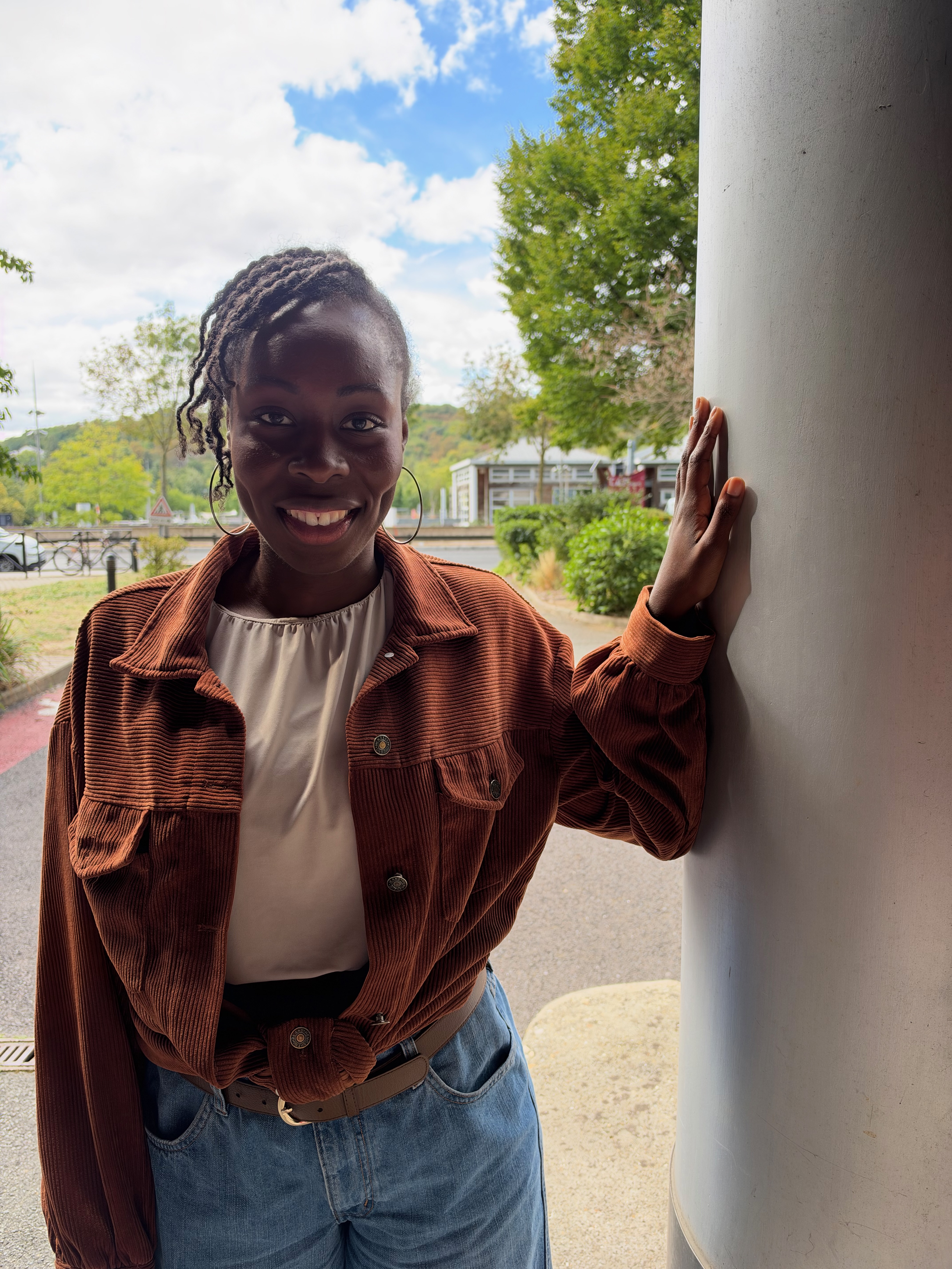
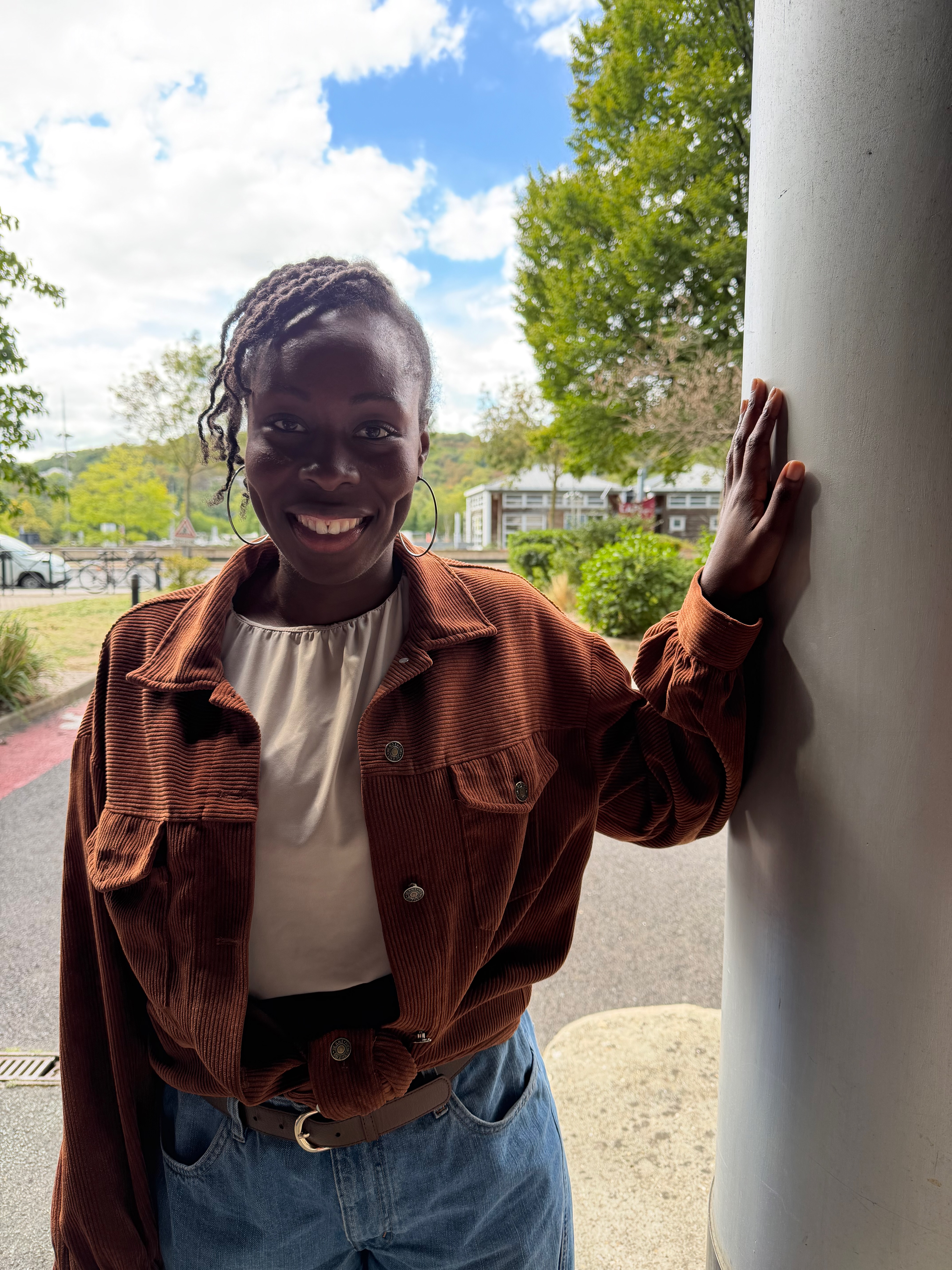
The caption on the close up says: “Details preserved on both face, face in the back in focus”. But it seems to me that a lot of detail is actually missing! On the later pictures you see a lot of skin “imperfections”, which looks much better. The 18 pro picture is way too smooth!
My issue is I'm getting to the point where I have to wonder if "Details in the back" are preserved, or if they're re-added via some sort of post-processing filter. Are those REALLY the details in the photo?
This is a question for the sake of curiousness; the article writer shot a couple of pictures of young black kids. I can't find any mention in the article, but is this just coincidence or is this commonly done becauses the darker skin is hard to shoot correctly?
It's relatively common and mostly a problem of exposure, especially in group photos. In general you want higher exposure for darker skin tones so that the camera resolves more detail, but at the same time you don't want the background overexposed.
Interesting to see what they got out of basically the same camera sensor. It seems largely just like way better denoising capabilities. Maybe that is why they needed the extra NPU in the A20 chip.
But even with that they are still behind Android phones, while they dominated some years ago
For instance th Xiaomi Ultra 17's main camera is faulted for having shallow depth of field or "autofocus decision errors", which I assume just means the auto selected subject wasn't the person straight in front of the camera ? [0]
These tests seem to be about versatility and predictability more than sheer performance.
> But even with that they are still behind Android phones, while they dominated some years ago
Flagship Android and iOS device cameras have been 1a/1b for awhile. It's video where Apple dominated. Did Android make some huge strides in video lately?
Anecdotically, my current OPPO find x9 mops the floor with my previous iphone 16 pro in photography in practice. The 1-1 with apple only seems to be there for Google and Samsung, but the Chinese flagships are a step up.
For video I think the iphone hasn't been dethroned yet.
Generationally yes, the oppo is more recent, but (AFAIR, I'm speaking from memory) the 17 improved just on the selfie and accesory lenses, the main camera remained mostly untouched.
Apple's cameras always look overprocessed to me. Not to the extent that some Chinese smartphone manufacturers replace your skin, but the general vibe of Apple's pictures is just off.
Some people really like that style, though. I think it's a matter of preference, and it seems like the people who like that style are exactly who Apple is optimizing their image algorithms for.
This particular iteration seems to increase the hallucinations a bit more than previous models, though. Unless one of the models did actually have one eye with eyelashes and one without for the iPhone shoot.
This has been the case since iPhone X. In all previous generations Apple was always the more natural looking profile. Since then they lost to the Instagram user base demands and started this over processing photos. They walk back some of it in the past 5 years but it is still extremely over processed in my view.
>Unless one of the models did actually have one eye with eyelashes and one without for the iPhone shoot.
This is just because the eye without eyelashes is on the side of her face that's in shadow. That means there's less contrast between the black of the eyelash and her skin tone (which is darker in the shadow area), and so the denoising algorithm wipes out the lash. All of this image processing happens way too fast on an iPhone for anything deserving the label of 'AI' to be involved. People are just going nuts over the unsurprising artefacts of a completely standard image processing pipeline.
The face is the background is clearly an AI model adding detail where the raw image is out of focus. The people you're talking to on this site are just blind.
don't worry about those AI artifacts. allow nature to heal itself. wait until the photo finds its way onto social media, and then re-posted onto another social media site. there, it will take the form of a highly compressed video frame, and now no one will notice any sort "rubber mask" phenomenon because it will be too compressed and covered with filters to notice anything at all. https://files.catbox.moe/r9zx6a.jpg
The girl in the front, sure. The girl behind? No. It's not even skin smoothing, there's not a single clearly defined feature to her face, while the hair at the same depth is markedly more detailed.
I wonder what percentage of pixels is actually from the camera's sensor vs made up / somewhat inspired by the data from the sensor. Maybe I'm too old for this, but I can't imagine people wanting their photos to look like this.




DXOMARK sells test equipment and consulting services for (among others) camera tuning.
Naturally, they won't attack the image quality of a customer who purchased their test equipment and/or consulting service (usually not publicly known who did that), so they often tone down some of their statements when they review a device (and shift the attention to other areas).
Always interesting to check out the scores of DXOMARK competitors in parallel, e.g. VCX[0] which strives for an objective scoring scheme (but didn't test the device yet, indicating that they at least didn't have an early sample)
[0] https://vcx-forum.org/score/phonecam-2025
reply